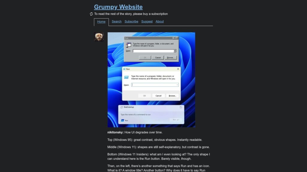
How UI Degrades Over Time
The article critiques the progressive decline in user interface clarity from Windows 95 to modern Windows 11 versions, highlighting how earlier interfaces offered high contrast and intuitive shapes that made features like the Run dialog instantly readable. In contrast, the latest designs suffer from poor contrast, unclear elements, redundant labels, and lack of visual cues, rendering the interface confusing and less functional for users. The author emphasizes that while older interfaces prioritized usability and adherence to system conventions, newer ones appear more like puzzles or art objects that fail to facilitate user tasks effectively.